Author Topic: Mario Maria Francisco Francisa Pedro Pedra Alexandra Alexandro  (Read 3058 times)

Offline InkyFingers

  • Hero Member
  • *****
  • Posts: 730
  • Karma: 56
  • All creations not equal.
    • View Profile
I was thoroughly satisfied with my progress, seeing the light at the tunnel;  I was going to abort this train and getting ready to hop onto a different train, until my dear uttered why I wrote Maria instead of Mario.  After carefully examining my writing, Dios Mio!, Maria and Mario does look the same.  Much to my distress, I asked @Rednaxela how is it one supposed to join letters to disambiguate the letters.

You see, the a and o seems very similar when your connecting stroke, that is the exiting stroke on o is a bit low, the o can be mistaken for a.  Looking at past master writing, even Madaraz's, have flaws.  Especially for the uninitiated, this is problematic.  If we use shade strokes, it is much easier to differentiate.  So here is my question....how are letters supposed to be joined?

Offline Salman Khattak

  • Hero Member
  • *****
  • Posts: 908
  • Karma: 67
    • View Profile
    • Toronto Pen Company
Re: Mario Maria Francisco Francisa Pedro Pedra Alexandra Alexandro
« Reply #1 on: May 13, 2018, 01:50:07 AM »
Assuming we are talking about Copperplate/Engrosser's Script, the exit stroke of the 'o' should be around 1/3rd of the x-height below the waist line (i.e. from the top of the 'o') while the exit hairline of the 'a' would be at the base line (i.e. the bottom of the 'o' and 'a'). Even if the exit stroke of the 'o' comes a little lower than prescribed, it should never go below mid x-height. When done this way, there is little chance of the exit strokes looking the same.

Also, the final stroke of the 'a' is an 'i' which means it should look very different at the waist line. The shaded 'blob' of the of 'o' should be inside the counter space and not squared and wide at the waist line.

It might help if we can see a picture of the offending 'o' :-)

- Salman
I have an opinion and I'm not afraid to use it.

Copperplate Tutorial :: Toronto Pen Company

Offline InkyFingers

  • Hero Member
  • *****
  • Posts: 730
  • Karma: 56
  • All creations not equal.
    • View Profile
Re: Mario Maria Francisco Francisa Pedro Pedra Alexandra Alexandro
« Reply #2 on: May 15, 2018, 01:33:54 AM »
Thank you @Salman Khattak for your reply.  I now understand.

I have been pondering this questions since my original post.  I hope this makes sense for those who did not adhere to the rules.


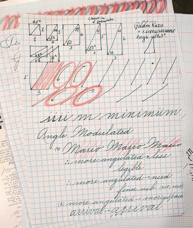
What does all this mean?  Using graph paper and not needing guided sheets.
1:1 Square - This is the ratio and geometry of the Roman Caps
3:4 Rectangle - This gives the closest to Spencerian slant degrees.
3:5 Rectangle - This gives the closest to the Golden Ratio rectangle.  (My Fav)
5:3 Rectangle - This gives the closes to Spencerian connecting slant (Also Golden Ratio & my Fav)

Doing drills of ovals, as @AnasaziWrites said is the primary principal.  There are three ovals which one must practice, not one! (Main slant, Connecting Slant and the Horizontal.)  The oval height should be the full breath of the small letter f.

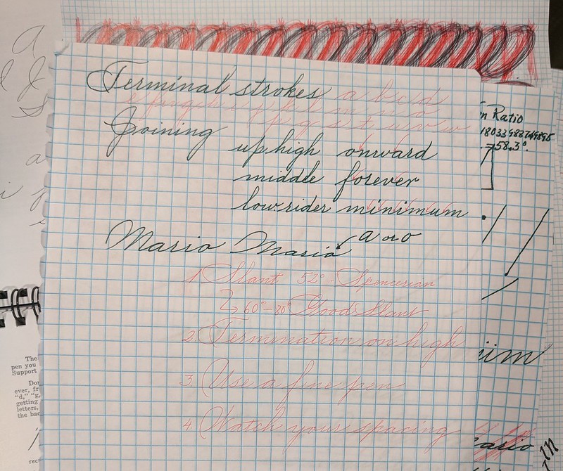
My mistake in rendering Mario/Maria is multiple fold: (slant, spacing, termination stroke/connecting stroke, and pen size)
*  Slant - the more the slant the faster the writing.  I write really quick, so my slant tends to be more acute.
*  Spacing - I kept the same spacing, hence rendering a very compressed writing.  It should be the more the slant, the more inter-letter spacing (or the connecting slant should be more pronounced.)  It is the connecting slant the determines the inter-letter spacing.
*  Termination stroke or connecting stroke, or "the power to join" the letters.  There's five types: low-to-low, low-to-high, high-to-middle, high-to-high, and the termination (often with flourish.)
*  Finally the pen size.  Choose wisely - bold to medium is for upright writing.  Fine and extra fine nib are for slanted writing.  The more the slant, the more extra fine the pen point must be to make the writing more legible.

« Last Edit: May 15, 2018, 01:40:33 AM by InkyFingers »

Offline InkedPaws

  • Freshman Member
  • *
  • Posts: 8
  • Karma: 0
    • View Profile
Re: Mario Maria Francisco Francisa Pedro Pedra Alexandra Alexandro
« Reply #3 on: May 15, 2018, 01:12:10 PM »
Hi InkyFingers,

Nice to meet you!

I am just starting out with Spencerian and have discovered that "square" grind paper do not work so well for me. I prefer paper with the slanted grids. I recently switched to that version and saw my work improve.

This chart helped me distinguish between the o and a.


I think I may know where the confusion is (someone correct me if I am wrong). The o takes up 1.5 squares while the a takes up a full 3 squares.
« Last Edit: May 15, 2018, 01:51:36 PM by InkedPaws »

Offline InkedPaws

  • Freshman Member
  • *
  • Posts: 8
  • Karma: 0
    • View Profile
Re: Mario Maria Francisco Francisa Pedro Pedra Alexandra Alexandro
« Reply #4 on: May 15, 2018, 01:39:52 PM »
Deleted post because I posted the wrong picture. Sorry!
« Last Edit: May 15, 2018, 04:44:24 PM by InkedPaws »

Offline InkyFingers

  • Hero Member
  • *****
  • Posts: 730
  • Karma: 56
  • All creations not equal.
    • View Profile
Re: Mario Maria Francisco Francisa Pedro Pedra Alexandra Alexandro
« Reply #5 on: May 15, 2018, 02:59:33 PM »
@InkedPaws I think we are related....where were you inked?  :o

For the uninitated...it gets confusing.  My writing is just sloppy.  I was trying to correct myself.

Your sample..is the running hand by John Bland is of tge English Roundhand, the precursor to Spencerian. 

Square grid paper is easier to find.  You can practice with many different script.

Drills in oval helped me..more importantly is the position and arm placement.  The more correct in posture and the more the oval is refined, the more improvement you will find.

Good luck and show us your progress.


Offline Salman Khattak

  • Hero Member
  • *****
  • Posts: 908
  • Karma: 67
    • View Profile
    • Toronto Pen Company
Re: Mario Maria Francisco Francisa Pedro Pedra Alexandra Alexandro
« Reply #6 on: May 15, 2018, 04:28:56 PM »
@InkyFingers

Ah - we are talking about Spencerian. It can get a little confusing with Spencerian if one is a little sloppy. The difference between the 'a' and the 'o' is well defined though:

1. The bowl of the 'a' (i.e. the round part) is stretched out to the left while the 'o' is uniform around the slant line.
2. The exit stroke for the a is at the base line while the 'o' exits at the waist line i.e. the exit stroke of the 'o' does not come down within the counter space of 'o' at all, there is just a slight curve to it after it exits. Care should be taken not to introduce any 'hot spots' at the top of the 'o' - it is easy to do with flexible nibs on the exit stroke.

These two differences together should be enough to make the letters clear in the script.

- Salman
I have an opinion and I'm not afraid to use it.

Copperplate Tutorial :: Toronto Pen Company

Offline InkedPaws

  • Freshman Member
  • *
  • Posts: 8
  • Karma: 0
    • View Profile
Re: Mario Maria Francisco Francisa Pedro Pedra Alexandra Alexandro
« Reply #7 on: May 15, 2018, 04:43:49 PM »
Sorry InkyFingers! Apparently, I'm such a newbie that I thought the Copperplate was Spencerian. I was trying so hard to look for comparisons of o's and a's that I was seeing the trees for the forest. I didn't even notice the shading because it was so thin. My bad!

As of right now, I don't have any work to post. Maybe in a month or two I might have some more courage to do so. Right now I can't even figure out how to make the wedges on the d. They look more like uneven fingers than wedges.

We might be related, yes. My username Inkedpaws come from the fact that my rabbit likes to hop across my desk over my calligraphy...

Offline InkyFingers

  • Hero Member
  • *****
  • Posts: 730
  • Karma: 56
  • All creations not equal.
    • View Profile
Re: Mario Maria Francisco Francisa Pedro Pedra Alexandra Alexandro
« Reply #8 on: August 30, 2018, 03:46:24 PM »