Show Posts

This section allows you to view all posts made by this member. Note that you can only see posts made in areas you currently have access to.


Messages - ErikH

Pages: [1] 2 3 ... 7
1
Show & Tell / Re: Stopping by to say hi and show off a little
« on: January 20, 2017, 05:27:12 AM »
brd4790: don't worry, you got this. You can totally break down that wall over there!
But maybe I shouldn't be giving out building advice ;)

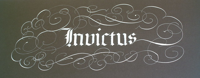
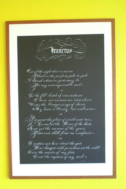
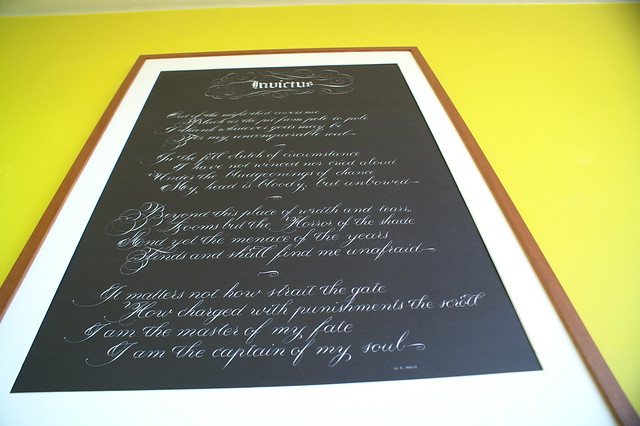
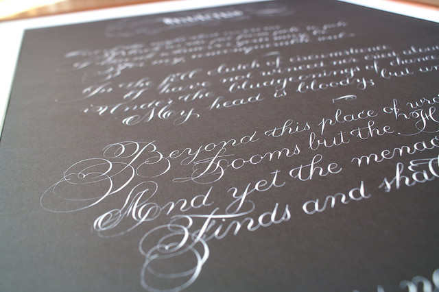
ash0kgirl: yes, all of those were done with a straight holder. I started with a straight, tried an oblique for a while a few years ago but never really got into it, and quickly returned to the safety and comfort of the familiar :)

prasad: absolutely! I'm also lucky enough to have an office job where I can occasionally get some calligraphy done on my lunch break, so no, it wasn't a complete break :)

2
Show & Tell / Stopping by to say hi and show off a little
« on: January 15, 2017, 05:09:27 PM »
Hi all,

It's been a while (now there's an understatement...) since I stopped by, but rest assured I haven't forgotten about this wonderful forum :)
Buying a house, doing a complete renovation (large parts of which I'm doing by myself), more hobbies than there are days in the week and moving somewhere in between all that have left me little time for calligraphy. Still, I've managed to do Christmas cards and I'm sneaking in time for birthday cards as well.

The Christmas cards were designed to be easy and fast to make: from cutting dimensions which left no parts of the paper unused, over generous use of a set of snowflake stamps to the much shorter "happy holidays" instead of "merry Christmas and a happy new year."
The envelopes were fun with white paint (Winsor & Newton's Bleedproof White) which flowed very well. Some deity must have been smiling upon me because I got every single one of them right the very first time. No do-overs whatsoever, which I'm very happy about.

As for this year's birthday cards: the text is a Dutch translation of a quote by Jean Paul Richter: "Our birthdays are feathers in the broad wing of time." Short, something to think about and a good excuse to draw a feather underneath.
For the envelopes I'm having some fun with a flourish pattern, both to stay in theme and because it's been too long and any excuse is a good excuse :)

All of the cards and envelopes (both Christmas and birthday) were done with my still favourite nib: the Gillott 303.

Something about the renovations which might seem silly: it's in part thanks to knowing that I can pull off flourishing that I've dared to tackle plastering the walls of the house despite just about everyone telling me I'm nuts to even try. Hooray for calligraphy-proven steady hands and calligraphy-inspired self-confidence!

3
Open Flourish | General Discussion / Re: Missing letters in scripts
« on: July 28, 2015, 08:38:28 AM »
Thank you for the advice... at least I'm not the only one struggling with this :)

4
Open Flourish | General Discussion / Missing letters in scripts
« on: July 26, 2015, 02:04:51 PM »
I'm currently teaching myself Irish half-uncials but there's a problem... the script apparently did not have a symbol for the letters j, k, v and w. I'm considering stealing those letters from insular half-uncials (they look as if they'll fit in), but I'm not very happy about deviating from the original script.

There are (quite a few) other scripts with missing letters out there... what do all of you do about this? Do you steal from a similar-enough style? Make up something yourself? Avoid those letters? (How?  :o)

5
Completed/Past Exchanges / Re: Offhand Flourishing Exchange Results
« on: July 25, 2015, 03:43:00 PM »
All of those are so gorgeous! I am so glad to have participated :)

The ones from list 1 are doing a great job of cheering up my wall:

6
Show & Tell / Invictus
« on: June 29, 2015, 02:53:56 PM »
Sometime in March this year I finished my first really big project. It was very much a confidence and happiness boost and is now proudly hanging on my wall, right over my calligraphy desk.

By way of ink I mixed Winsor & Newton bleedproof white gouache with water and gum arabic. The paper is A1-sized Daler-Rowney Canford (I believe - I have a bad habit of not giving paper the attention it deserves). In order to combine the two I used a few Gillot 303 nibs for the text and flourishes, and a Brause 180 (4mm) for the title.


7
Erik... Your name kept tripping me up, I corrected myself twice on the inside stuff... and I was dropping them off, I realised it was 'Eric' on the envelope!!!!! AARGGH.... forgive me please!!

Ha, don't worry about it... Eric is my secret Evil Persona (sshh!). I'll just have to make sure I get to the envelope before he does :)

Hope you're feeling better!

8
Mine were mailed yesterday, but I do have to apologise for forgetting to mark the exchange on the envelope.

About posting: what is the usual way? Do we post the ones we receive or the ones we send out?

9
I have only just today finished the design into something I'm pleased with (and I'm sure I'll be ashamed of it as soon as I receive the first one from someone else ;D). I'm so glad I'm not the only one using all the available time! The goal is to make the final versions this weekend and mail them on Monday or Tuesday.

10
I'm going to regret this when stressing out because OMIGAWDINEEDMORETIMEWHYDIDIDOTHIS, but it's going to be so worth it :-)

11
Open Flourish | General Discussion / Re: Gillott colour question
« on: March 03, 2015, 03:35:02 PM »
That's quite interesting, so it feels just like a blue one when you write?

Vintage 303s are smoother, some flex less than the modern ones while others about the same. Vintage ones also arch less and are a bit larger (from my experience)

As for the grind SMK is referring to, check out this image, the one on the left has a cross grind--each nib was hand ground but most manufacturers then switched to stamping in order to save money which you see on the two on the right. It's essentially a simulated grind to thin out the metal and make it more flexible. Modern 303s (well, any modern nib) will at most have stamped grooves on it. The hand grind is really fine for the most part but it looks like a high grit sanding.

Subtle difference: it feels like a blue one as far as I can tell :) I unfortunately have no other 303s available to compare, having thrown out my last blue 303 several weeks ago. Plus, I'm not that sensitive to subtleties  :-[ I'll probably get a chance to buy new blue ones in a month and a half (bookbinders' fair)... Will compare again then.

So that's what that is; thanks for the explanation and very clear picture :) I've seen it on other nibs, but on these it's all but invisible to my eyes. Argh.

12
Open Flourish | General Discussion / Re: Gillott colour question
« on: March 03, 2015, 08:58:57 AM »
They were ordered from Mary Koperdraat, a Dutch calligraphy materials supplier. Her website makes no mention of vintage nibs (I'm sure they'd be more expensive - they sound expensive), so if they really are, her supplier probably made an error. If so, that would mean I now accidentally have 30 vintage nibs :o This seems spiffy, but unlikely.

I had some time to try one out during lunch break today; while it was fairly scratchy (especially compared to the 170s I've been using the past few weeks) it wrote pretty much as expeced. The brown comes off just as much as the blue does when wiping ink off (there's even some blue patches shining through as well - edit:: two pictures, bottom is new, top is after some usage).

SMK: what do you mean by grinding? I'm not quite sure what to look for to see what you mean.

And, to further reveal my ignorance on this topic: what are the main differences between vintage and regular nibs?

I wish the Gillott 303 was easily available here in the Philippines. :(

As mentioned in a separate thread, Erik, I can't seem to toss mine out until I find another one. Haha! :)

Here in Indonesia as well, so hard to find nibs like that. And if do find, it'll be twice the price than what it should be. :(

Would it be realistic for me to order for you and then ship them onwards? Or would shipping costs / customs / taxes / ... be outrageous?

13
Open Flourish | General Discussion / Gillott colour question
« on: March 02, 2015, 04:28:29 PM »
I recently received my new nibs (beloved 303 :) ) and noticed that, instead of that lovely blue shine, these are a more brownish colour. After the initial "wha? :o" I moved on to thinking that this batch may be made from a slightly different material, but I don't really know... Can any of you experts shed some light on this?

And, while we're on the subject, where does that blue colour come from?

Pic for reference: the new 303 on the left, the 170 in the expected colour on the right.

14
Same here, if it starts snagging too much it goes, no mercy.
As an extra check, I'll often look at it against a bright surface (a window by day does nicely for that purpose). If there's space between the tines, it definitely goes.

15
Favorite Resources / Samples from old books
« on: February 25, 2015, 07:03:22 AM »
I came across this website while looking for some inspiration for the Ransom Note exchange. It has images, letters, etc from old books, and they have quite the search functionality as well.

http://www.fromoldbooks.org

(I hope I'm not offending by posting this both here and in the Ransom Note thread; just didn't want it to get lost in there :) )

Pages: [1] 2 3 ... 7