Show Posts

This section allows you to view all posts made by this member. Note that you can only see posts made in areas you currently have access to.


Messages - Inkysloth

Pages: [1] 2 3 ... 9
1
Looks amazing! Might be a bit of a bus ride for me though. :)

It's a good reason for a paddle across the pond!

2
Hi all,

Not strictly calligraphic, but involving exquisite hand lettering, so I think it's relevant!

The Type Archive in Kennington, South London is reopening to the public, starting with a month-long exhibition of Berthold Wolpe's work.

http://www.typearchive.org/

I visited on Tuesday evening, and it's a beautiful exhibition - small, but condensed, looking at the design of five of Wolpe's typefaces, and some of his book jacket designs. If you can get along, it's worth the time.

3
Show & Tell / A bit of letter cutting in slate
« on: September 07, 2017, 06:13:00 PM »
I'm taking a foundation diploma at a residential art college in the South of England (it's 10 short courses over two years, so I go there for 3-5 days every couple of months) and my last course was "letter cutting in stone and slate" taught by Tom Perkins. If you've not come across his work, look him up - his work is exquisite.

I've not done any stone carving before, beyond a couple of hours a year or so ago, and a very brief go when I was about 10, so I'm quite pleased with how this has turned out, though I can see so many things that need improvement. Mostly down to familiarity with the tools - I have no finesse with the chisel. That should come with practice though.

First drew up the lettering on paper, then transferred that to the slate with white watercolour pencil
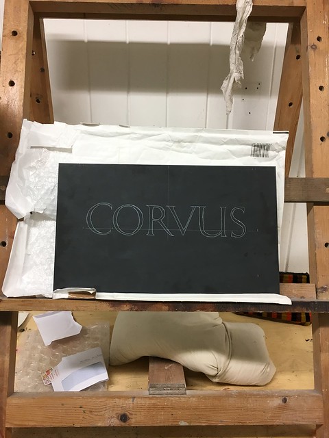
corvus 09 17 by Robin Inkysloth, on Flickr

Then carved it out!
corvus 4 09 17 by Robin Inkysloth, on Flickr

I'm looking forward to getting my own tools & some scrap slate to practice on. It's a very different experience to pen & ink work, but is really satisfying.

4
Completed/Past Exchanges / Re: Precious Pet Exchange 2017!
« on: August 25, 2017, 06:06:22 PM »
Hi List 2!

I've let time get away with me so will be posting a bit late... sorry for this.

Best wishes

Robin

5
Broad Edge Pen Calligraphy / Re: Lombardic Versals
« on: August 03, 2017, 06:32:59 PM »
I do like a nice Lombardic versal!

The only complete linoprint alphabet I've done has been Lombardic versal-ish... going more for dramatic effect than historical accuracy, though.

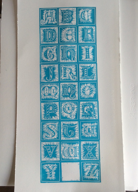
Linocut versal alphabet by Robin Inkysloth, on Flickr

6
The Library / Re: George Bickham: Round Text Copybook
« on: July 30, 2017, 03:34:45 PM »
This is exactly what I've been looking for! Thanks for sharing this :)

7
Show & Tell / Re: Show us your best
« on: July 27, 2017, 12:18:24 PM »
I've often felt the same way. Could that mean we are still improving?

I hope so!

8
Completed/Past Exchanges / Re: Precious Pet Exchange 2017!
« on: July 27, 2017, 11:53:00 AM »
I'm in!

I'm glad you posted this, each time I remembered to checked in over the last few months I've just missed an exchange date >_<

*gets doodling*

9
Broad Edge Pen Calligraphy / Re: Upright italic - critique welcomed
« on: July 27, 2017, 11:50:36 AM »
Hi Myles Ink - harsh criticism is fine - I'm looking to improve, and don't take it too personally :)

The nibs I usually use are William Mitchell Roundhand - I think this one was a number 3 or 3 1/2... or maybe a 2 2 1/2... something around that area, anyway! I tend not to use fountain pens for calligraphy practice unless I'm away from home & can't get my ink pot out.

I've reduced my tittles considerably, using a dash more often than not now, it definitely looks cleaner. 

Definitely need to work on my r's, and generally on spacing. That's my nemesis I think.

Thank you!

Wow! You have a very well structured script and it seems that you have a very profound comprehension of this script. It is very satisfying and inspiring. Nice job!

What instrument did you use for this work? I assume that your work was done with a Manuscript medium.

Your lines look precise and seamless. However, it is notable that your tittles are a bit too outlandish. Some readers may confuse them with a comma. 

Your minuscule 'r's are unorthodox in my opinion, they crouch towards the south and leaves a considerable gap in the script. When executing the 'r', make sure that your finishing stroke leaves with a full width. Furthermore, many 'r's were not constant and some of them were mistaken for a v.

The general composition of this work seems like your grip is a bit too tight. The tripod grip is usually recommended for broad edged scripts.

I apologize for the harsh criticism but I believe in your potential! What an amazing piece you have created. Feel proud for all your works and continue writing! ;)
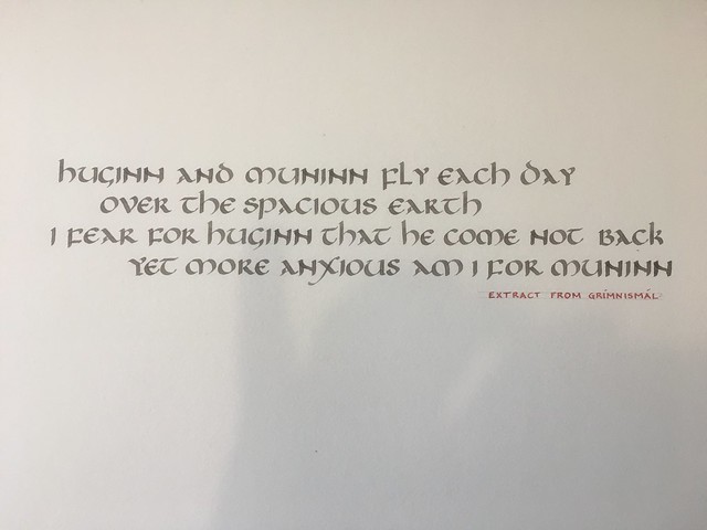
10
Show & Tell / Re: Show us your best
« on: July 27, 2017, 11:42:44 AM »
Hi all,

Best is a hard word... each piece of work I make I can see the mistakes, or where improvement's needed, and generally it's only the most recent thing that I feel halfway satisfied with!

That said, I'm pleased with this, it's quiet and not exciting, but clear and clean, which is what I hanker after!

Huginn &amp; Muninn uncial by Robin Inkysloth, on Flickr

11
This is really interesting - and useful - many thanks!

12
Hi all!

I've not been drawn towards learning pointed pen calligraphy up until recently, but I've been prompted to actually try to learn, so I'm starting with an English Roundhand - I'm using these as my exemplars: https://blog.typekit.com/alternate/a-history-english-round-hand-and-the-universal-penman/

I have a way to go yet, but this is my third day of focussed practice, and I'm starting to believe I might be able to get there at some point! I'm looking to be able to execute a neat, graceful style - it doesn't need to be flourished or overly formal, elegance and grace is what I'm hoping to learn.

Roundhand practice by Robin Inkysloth, on Flickr

Any critique & recommendations would be gladly received.

13
Show & Tell / Re: Calligraphy - playing with blending ink
« on: March 12, 2017, 11:30:18 AM »
Ooh that's lovely!

14
Show & Tell / Weeds!
« on: March 12, 2017, 11:24:24 AM »
I submitted this piece for the Calligraphy & Lettering Arts Society exhibition:

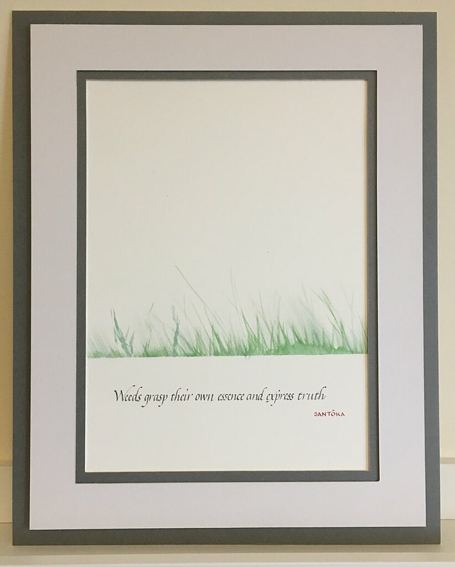
Submission for 2017 CLAS exhibition by Robin Inkysloth, on Flickr

Annoyingly, I made four copies and in each one either stuffed up the weeds or the writing. And the deadline for submission was too close to do another copy, so this was the least wrong copy!

(BTW anyone in the UK that hasn't joined CLAS, it's worth joining for the newsletter & study days they run)

15
Copperplate, Engrosser's Script, Roundhand Calligraphy / Re: Ink woes
« on: March 08, 2017, 06:07:09 PM »
Seconding ESSRI!

It lasts for ages, too - I bought a bottle 3+ years ago, have been using it in a Lamy Safari and as a dip ink since then, and am only about halfway through the bottle. Admittedly I'm also using Higgins Eternal for dip-pen lettering, but those two are my go-to inks for practice, and depending on the end effect desired, final work.

If you want to try some, PM me and I'll pop a sample in the post to you.

best wishes

Robin

Pages: [1] 2 3 ... 9